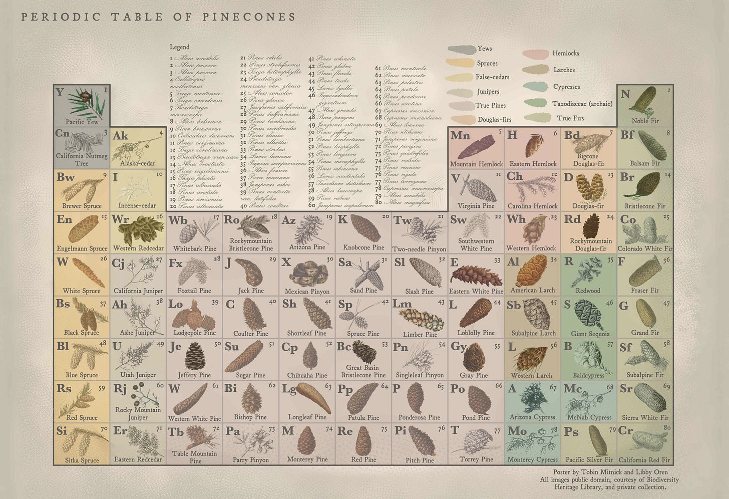
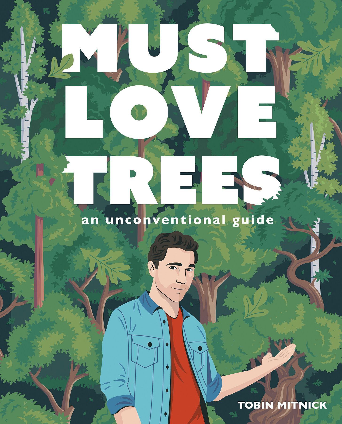
Yesterday, Libby Oren and I introduced the Periodic Table of Pinecones. It will function as one of our main pieces of giveaway swag for all public events for Must Love Trees: An Unconventional Guide this spring, starting with the book launch at the Skirball Center on April 11th at 7:30pm (seriously, reserve free tickets for this now because they are going fast—you can also buy a book directly from the Skirball on the website and have me sign it that evening). We’re also working to make the poster available for purchase online in a slightly bigger 18” x 24” format so you can get your money’s worth.
I’ve had this idea in my head for six months or so, and when I started working with Libby, it was clear that this was a person with the kind of casual expertise in graphic design and poster-making as well as shameless botanical nerdiness that could make it a reality.
Inspiration
In my childhood kitchen, we had a poster entitled “The Periodic Table of the Desserts”:
It was designed by Naomi Weissman, who also created a “Periodic Table of the Vegetables” as well as a “Periodic Table of the Fruits and Nuts”. It’s safe to say I was obsessed with this print. I don’t even think I realized that it was a take on the real periodic table until I learned what the real periodic table was. So, until I was ten or so, I loved looking at this poster as a true informative chart, which maintained the original atomic symbols and found desserts to suit them (“H” = Hamentashen, “Os”= Oreos, brilliant), then threw in the calorie count as atomic mass and added fanciful latinate names like the desserts were actual species. This final flourish has literally nothing to do with the real periodic table, but Naomi just felt like having fun, and, in doing so, she gave fun to all of us.
I was also just a huge fan of its hand-painted art by artist Susan Stanley. Every dessert is rendered with such love and clarity. Nothing like some of the cRaZy parody periodic tables you’ll find online or at Spencer’s Gifts. I thought it was real because it looks real. In other words, Weissman and Stanley went all the way. For me, there is no other way.
Sourcing
I’m not sure when I became aware of the Biodiversity Heritage Library’s image database online, but it’s one of the most remarkable resources I’ve ever come across. They have roughly 320k public domain images (well, most are PD, some require institutional approval, a couple still have copyrights) of old botanical drawings from some of the most preeminent naturalists of all time. The public domain aspect of this was obviously appealing to Libby and I, since hiring someone to hand-paint all roughly eighty native North American cones (not all are pinecones, but I took the shortcut for alliteration purposes) would be cost-prohibitive.
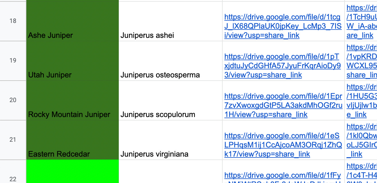
So, we set about sleuthing, using key word searches such as “pinus,” “pine,” “spruce,” “abies,” “cone,” “hemlock,” “macrophylla,” “pseudotsuga,” and other increasingly esoteric terminology in order to find ye olde renderings of our desired cones and add them to the google doc. We managed to scout about fifty-five off the website alone.
It required a bunch of hunch work and detective work, since the modern scientific names of many conifers were up in the air until the turn of the twentieth century. An Abies could be referred to as a Pinus (especially before 1850), a Douglas-fir could be referred to as a Spruce, and so on. I often turned to resources like The Gymnosperm Database in order to confirm that the modern name and the archaic name of a given cone plate matched up. But, to quote Libby, “I actually had a lot of fun.”
The naturalist sources were extremely varied up until cone 55, ranging from Franz Antoine’s 1840 masterpiece “Die Coniferen” to Thomas Nuttall’s “The North American Sylva”(1865).
Then I happened upon the work of Charles Sprague Sargent (a man who “knew more about trees than any other living person”) and his “Manual of the Trees of North America”(1922). Boom, we had the rest of our pinecones. We also had a nice mix of finely detailed watercolors, black-and-white pen, and just some beautiful-ass shit like this:
Assembly
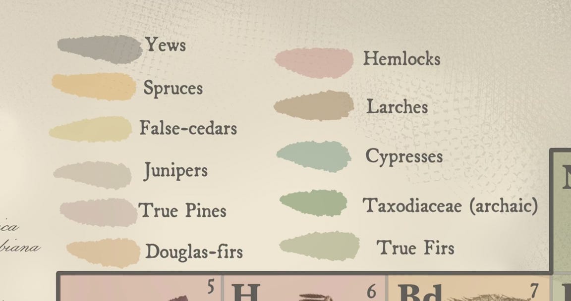
Libby and I decided to add a dose of Naomi Weissman-esque whimsy and fabricate corresponding atomic symbols for each cone, then group them by family so that you can clearly see the morphological differences between each type of cone (Pine, Spruce, Douglas-fir, etc.). Libby used a muted color palette to sort the cones that I thought was pretty genius at evoking the feel of the turn-of-the-century botanical plates.
I made an executive decision and decided to group the Redwood, Giant Sequoia, and Baldcypress by their archaic family Taxodiaceae for convenience as long as I marked it in the legend. The past twenty years have brought forth chemical research that shows these trees probably don’t belong together taxonomy-wise, but I want to make the disclaimer that you SHOULD NOT, under any circumstances, use this chart as an up-to-date study guide. There, now it’s ok that I did a bad thing, science-wise.
The total number of cones on the chart is eighty, which is obviously lower than the 118 elements on the actual periodic table but it still gives a good sense of its shape. Finally, we purchased two old fonts from a website called “oldfonts.com”, which made sense, and we had the poster. Well, after a lot of back and forth and debate about grouping, coloring, the addition of the “(archaic)”, some clarification about the standardization of hyphens, etc.
Uses
Few. This is a novelty poster. Libby and I agreed that, if you’re going to make a novelty poster, it should really only convey one useful piece of information aside from the obvious joke and design so that you don’t seem too up-your-own-ass. In the Periodic Table of Pinecones, it’s the general variation between types of cones, which imitates the groups on the real Periodic Table. Below, you can see the difference between a Giant Sequoia (Sequoiadendron giganteum) cone, which is hard and compact, and a Grand Fir (Abies grandis) cone, which stands upright with soft, pliable scales, anticipating a slow atomization while still on the branch.
Like in the Periodic Table of the Desserts, the atomic numbers are largely arbitrary but they serve as a key for the scientific names listed at the top of the poster.
That’s the poster.
Have a beautiful weekend,
Tobin
An Out-of-Context Sentence from Must Love Trees: An Unconventional Guide
Page 76:
“…the end of a cone scale is called an “umbo,” and the prickly ones, like the ponderosa, have what’s called a—get this— “prickle” on the end. I mean, it’s as if two warring botanists got together in 1823 for the purpose of naming the parts of a pine cone and simultaneously said, “Hey pal, let’s set aside our differences and just get cute right now.”
Pre-order from:
Audrey’s Museum Store at the Skirball Center (for book launch signing)


Uses. Few. Funny! And the poster is gorgeous!
Seconded on making these posters available for order!!